Executive Console - Understanding Charts
In the Executive Console, you can use charts to graphically compare the data elements within a key performance indicator. You can create an ad hoc chart or save the chart's definition (called the Compare View) for later use. The charts allow you to compare more than one Data Series on multiple X-axes. For example, you can compare Current, 30-day, and 60-day totals all on one chart.
Plot data for key performance indicators.
Create bar charts and line charts.
Plot different Data Series on multiple X-axes.
Display in 2D or 3D.
Rotate chart orientation.
Focus chart on specific Data Series and Categories.
Key Performance Indicator (KPI) Definition: Quantifiable metrics, both financial and non-financial, used to assess the present state of the business and to prescribe a course of action.
The Executive Console displays the available KPIs for your application (INSight, Edifice, Invision, etc.) in the Key Performance Indicators Panel. The application pushes the data into EMS using various methods. Some applications require special utilities to load the data to EMS. Other applications load the data directly from normal reports and processes.
To see information about the key performance indicators for each application,
see the Key Performance Indicators topic.
Tip: This
topic requires Internet access and the Adobe
Reader.
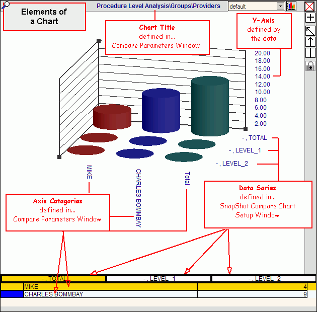
Tip: To see a diagram of the elements of a chart, click More.
The following terminology is used when describing charts:
Compare View: A defined view for a chart. A Compare View allows you to graphically compare key performance indicator data in a bar chart or line chart. To save the definition of a chart, you must assign a Compare View Name.
Chart Title: The Chart Title automatically appears at the top of the chart. It is derived from the Data Set and Compare Elements defined in the Compare Parameters Window.
Y-Axis: The vertical bar containing tick marks (labels) for the data scale. The Y-axis values come directly from the data, and the software automatically determines the tick mark scale and labels.
X-Axis: The horizontal bar containing labels for axis categories. You can have multiple X-axes, one for each data series.
Data Set: A set of predefined data for a key performance indicator. You can select one data set to include in a chart.
Compare Element: A sub-set of nested data groupings within a data set. You can select one or more compare elements to be included in a chart. To focus the chart on a single compare element, in the chart's legend you can click the compare element, which appears as a legend heading.
Category for X-Axis: A field within a selected compare element. You can select one or more categories to appear in a chart. The category names appear as vertical labels on the X-axis. To focus the chart on a single category, you can click the category in the chart's legend, which appears as a legend detail row. For example, if you specify several medical providers to be included in a chart, then each provider is a category.
Data Series: Data buckets that allow you to compare the categories among different series. Each series adds another X-axis. For example, you can display the aging dollars for more than one bucket, such as Current, 30-day, and 60-day.
Data Hierarchy:
Key Performance Indicator
Data Set
Compare Element
Category
Data Series
This section describes the basic steps for creating a chart. For more information, click the hyperlinks included in the directions.
1. Setup the Compare Parameters for the chart:
a. Open the Executive Console.
b. Click
Compare View  in
the Key
Performance Indicators Panel.
in
the Key
Performance Indicators Panel.
Tip: Each
time you open a Compare
View chart, a new sub-panel for the chart opens in the Content
View Panel. You
can scroll to see all of the open KPI charts.
c. Click
a KPI.
Tip: You
may have to click Plus ![]() to open one or more headings before revealing
a specific KPI. To
close heading levels, click Minus
to open one or more headings before revealing
a specific KPI. To
close heading levels, click Minus ![]() .
.
d. To
display the Compare
Parameters Window, click Search ![]() in the Content View Panel.
in the Content View Panel.
e. Fill
in the Compare Parameters.
Tips:
You can skip the Name if you want, for now.
If you
want to use an existing compare view, click Open
 and select the Compare View that you want
to maintain.
and select the Compare View that you want
to maintain.
2. Set up the Data Series for the chart:
a. To
display the SnapShot
Compare Chart Setup Window, click Chart
 at the Compare Parameters Window.
b. Define the settings in the SnapShot Compare Chart Setup window.
c. To return to the Compare Parameters
window, click OK  .
.
d. If
you want to save the Compare View definition for future use, enter the
Name
and click Save
 at the Compare Parameters Window.
Otherwise, skip this step.
e. To
display the chart in the Content View Panel, click OK
at the Compare Parameters Window.
Tip: You
can alternatively display the chart in the SnapShot
Compare Window.
To see information about opening and changing the look of a chart, see the Executive Console - How To... topic.
![]()