 in
the Key
Performance Indicators Panel.
in
the Key
Performance Indicators Panel.Tip: Each time you open a Compare View chart, a new sub-panel for the chart opens in the Content View Panel. You can scroll to see all of the open KPI charts.
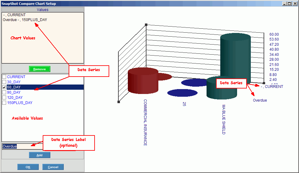
Executive Console - SnapShot Compare Chart Setup Window
Use the SnapShot Compare Chart Setup Window to define the Data Series for a Compare View, which is a defined view for a chart. A Data Series is one or more data buckets used to compare the Categories among different series. Each series adds an additional X-axis to the chart for comparison. For example, you can display the aging dollars for more than one bucket (data series), such as Current, 30-day, and 60-day. The table following the window example describes the SnapShot Compare Chart Setup Window for the Executive Console.
For additional information, click More.
Tips:
For more information about charts, see the Executive Console - Understanding Charts topic.
For information
about specific KPIs for an application, see the Key Performance
Indicators topic.
Tip: This
topic requires Internet access and the Adobe
Reader.
For more information about working with KPI reports, see the Executive Console - How To... topic.
For more information about working with data in fields, see the Data Entry Guidelines.
Directions:
To display the SnapShot Compare Chart Setup Window:
1. Open the Executive Console.
2. Click
Compare View in
the Key
Performance Indicators Panel.
Tip: Each
time you open a Compare
View chart, a new sub-panel for the chart opens in the Content View
Panel. You
can scroll to see all of the open KPI charts.
3. Click
a KPI.
Tip: You
may have to click Plus ![]() to open one or more headings before revealing
a specific KPI. To
close heading levels, click Minus
to open one or more headings before revealing
a specific KPI. To
close heading levels, click Minus ![]() .
.
4. To display the Compare Parameters Window:
Click
Search ![]() in
the Content
View Panel.
in
the Content
View Panel.
Or, click Search in the SnapShot Compare Window.
5. Fill
in the Compare Parameters.
Tip: You
can skip the Name if you want, for now.
6. To
display the SnapShot Compare Chart Setup Window, click Chart
 .
.
To set up the Data Series for the chart:
1. Define
the settings in the SnapShot Compare Chart Setup window, and then to return
to the Compare Parameters window, click OK
 .
.
2. If
you want to save the Compare View definition for future use, enter the
Name
and click Save
 at the Compare Parameters Window.
3. To
display the chart in the Content
View Panel, click OK at the
Compare Parameters Window.
Tip: You
can alternatively display the chart in the SnapShot
Compare Window.
Executive Console - SnapShot Compare Chart Setup Window Example:
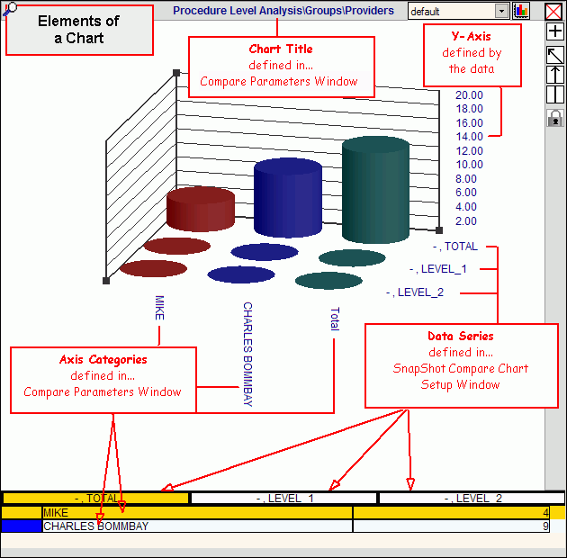
Tip: To see a diagram of the elements of a chart, click More.
|
SnapShot Compare Chart Setup Prompts Tip: To see more information about a field, click the hyperlink for the field name. |
|
|
Data Series - Chart Values |
Displays the Data Series values that have been added to the chart. Directions: To remove a Data Series from the Chart Values list: 1. Click to highlight the value. 2. Click
Remove. |
|
|
Removes a Data Series value from the Chart Values list. Keyboard Shortcut: [ALT + r] |
|
Data Series - Available Values |
Displays the Data Series values available for the chart. Directions: To add a Data Series to the Chart Values list: 1. Click
to select
one or more values. 2. Optionally
enter a Data Series Label. 3. Click
Add. Tip: The Available Values are predefined in the software for the KPI. |
|
Enter the Data Series Label that will be used on the chart for the X-axis. This optional label replaces the default value that appears in the Available Values list. (unlimited characters) | |
|
|
Adds a Data Series value to the Chart Values list. Keyboard Shortcut: [ALT + a] |
|
|
To close the SnapShot Setup window and return to the Compare Parameters Window, click OK or press [ENTER]. Keyboard Shortcut: [ALT + o] |
|
|
To cancel the SnapShot Setup window, click Cancel. Keyboard Shortcut: [ALT + c] |
|
Chart Example |
As you maintain the Data Series values, you can immediately see the effect on the chart. |
![]()


